top of page
7 ELEVEN
P.O.S. REDESIGN
_edited.png)
33%
transaction
time
reduction
+15
sales volume
per hour
9/10
Usability
score
Empathized
OKR's &
Stakeholder
requirements
understanding
Personas
User
Interviews
1
•
•
•
Definition
Problem and
goals
User flows
2
•
•
Ideation
Concept
sketching
Design
workshop
3
•
•
Prototypes
MVP hi-fi
prototypes
4
•
Testing
Usability
testing on-site
Iteration
based on
testing
feedback
5
•
•
End-to-end UX UI design thinking process

Context
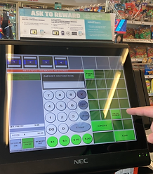
Fuel transactions are vital for 7-11 stores supporting gas, but the current design wasn't user-centered.
this P.O.S. (Point of Sale) UX UI experience was outdated. Leading the redesign to create a user-friendly, scalable, and ADA compliant experience across 10,100+ stores.
Project duration: 8 months
Platform: P.O.S. system
The team
Product
Designer (Me)
Product
Manager
Chief Design
Officer
Jr Designer
8 Developers
Q & A
OKRs
_edited.png)
Improve sales
time for gas and store products

Enhance
accessibility
USER RESEARCH
15 users interviewed on-site during 1 week.
70%
Current user satisfaction
score from feedback.
Users main complains:
"Most of the time is hard to read the amount on the pump cards and text on buttons."
"The buttons look all the same, we memorize them after a while, that’s how we make sale transactions faster."
“It’s hard to understand the pump status and what to do if there is an issue with the pump”
PROBLEM & GOALS
%201%20(1)_edited.png)
Current P.O.S. UI from the 90's


Not user-friendly, not intuitive
Issues
Readability
Not ADA compliant
Accessibility
Not enough pump
statuses
Communication
UX UI
Goals
Improve readability
100% ADA compliant
Accessible UX UI
Effective
Communication
Complete and clear pump status communication
Best-in-Class
UX UI
User-friendly and intuitive experience
DESIGN APPROACH
First
sketches
Ideas to enhance fuel selling experience
Drawing on insights from user interviews and testing of the current POS system, I sketched initial ideas.

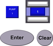
Pump cards
Prioritizing accessibility and being
user-friendly, I explored the use of different colors and unique icons to represent each pump status. I developed three different options based on this concept and presented them to the team.

Notification bar
To further enhance communication, I proposed the addition of a notification bar for crucial alerts and urgent information that users should address immediately. I explored several concepts before presenting them to the team.
Collaborative
design workshop
to refine components for the gas pump status indicators and alerts.
Together, we voted on the most intuitive designs. I proposed using distinct iconography for each pump status and adding an alert navigation bar. The team embraced these ideas and voted on the best options presented for both. This process produced a strong initial draft of a user-friendly, efficient interface for our gas sales system.

Whiteboard sketches from the workshop at the Texas 7-11 headquarters
Led a 3 day workshop and brainstormed different solutions
High-fi design solutions

Pump statuses
Expanded pump
statuses
Incorporated 7 new statuses for better communication
100% ADA
compliant
Readable text with high contrast
Iconography/
new UI library
Created a new user-friendly/accessible library for gas sales, including icons, colors and other components
After
Before
_edited.png)
Scalability
Legible icons & texts
Throughout the project, on-store user interviews introduced a new challenge. The varying number of pumps across stores (ranging from 8 to 32) required me to adjust icon designs for different screen sizes.
Originally designed for a 116x78px space, I had to optimize icons to fit a more compact 58x20px space in larger pump setups.


Better communication
Pump status bar
Designed a bar that appears upon clicking the pump-card, providing a detailed description of the pump status.
This feature allows associates to quickly understand the status of each pump and take appropriate action, thereby improving overall efficiency and customer service.


_edited.png)
Notification bar
To display important
updates and pump statuses
that require immediate attention.
This feature helps associates stay informed in real-time, enabling them to efficiently manage pump issues and maintain smooth store operations.

USABILITY TESTING
& ITERATIONS MVP
Tested 20 users
on-site
during 1 month

Collaborated with the junior UX/UI designer to test the initial MVP in two 7-Eleven stores.
Collected and documented data as requested by the product manager: quantitative data on transaction times and sales volume per hour, as well as qualitative data on user satisfaction and overall experience feedback.


Increased %15
on user
satisfaction
Previous: 70%
MVP 1: 85%
• Improved readability
• Smooth overall experience
• User-friendly interface
• Essential information easily accessible
• Faster sales
Adjustments based on
feedback
Icons meaning
Despite positive feedback on the iconography, some users struggled to understand the meaning of certain icons.


I fixed this by adding a description to each pump status
Before

MVP 1
After

MVP 2
Increased
to 95%
on user
satisfaction
Previous: 70%
MVP 1: 85%
MVP 2: 95%
Adding descriptive text to each pump status significantly increased user satisfaction and task efficiency during the second round of user testing.

RESULT & IMPACT
Improved sales
for gas and store products

33%
transaction
time
reduction

+15
sales volume
per hour
95%
User
satisfaction
_edited.png)


Enhanced UX & UI
100%
ADA
compliant
+ Accessible
+User friendly


9/10
Usability
score
REFLECTION &
TAKEAWAYS
_edited.png)
What I did well and what I am proud of
Championing Accessible UX/UI:
I advocated for creating an accessible UX/UI, which directly contributed to increased user satisfaction, sales, and operational efficiency.
I'm proud of being part of a team open to new ideas, where I introduced the use of iconography to enhance pump status communication.
What I'm taking with me
Focus on Continuous Iteration:
I've learned the value of continuously iterating on products to refine UX/UI based on initial testing and user feedback.
Importance of Deep User Research:
I recognize the need for thorough user research to truly understand user needs and design user-centric experiences.
Thanks for reading


bottom of page