top of page
90%
Positive
user
feedback
SINCH B2B SaaS
WEB FAX APP
_edited.png)
User flows > UI design > Prototyping > User testing > Handoff to dev
60%
User
retention
rate
7-10
Minutes per
session

Context
The objective was to develop a cloud-based fax Sinch service app from scratch, facilitating secure and reliable document transfers via an API. This initiative aimed to empower users to confidently share sensitive documents like medical records, legal contracts, or even food orders.
Project duration
6 months
Platform
Desktop app
The team
PRODUCT
DESIGNER (ME)
PRODUCT
MANAGER
PROJECT
MANAGER
UI
DESIGNER
6
DEVELOPERS
Q & A
OKRs
Maintain a high retention rate to ensure sustained user engagement and satisfaction.
Develop an intuitive and efficient application that enables users to seamlessly manage and share their fax documents.


USER RESEARCH

User's feedback - Affinity mapping:
Users from other services, including SMS and Elastic SIP Trunking, have expressed a longstanding desire for a Fax app service. To address this demand, I collaborated closely with the product manager to consolidate user feedback. Through affinity mapping, we organized the multitude of notes and data, initially overwhelming but ultimately yielding clear initial main categories of user requests:

FAXES PAGE
Ability to view a comprehensive list of all sent faxes.
FAX SERVICES
Admin faxes settings like incoming, sent, and associated phone numbers.
ANALYTICS
Analytical insights for fax usage patterns.
DESIGN APPROACH
First sketches
From Product Management:
The initial sketches shared by the product manager, encapsulated within a Confluence file, provided a foundational framework for the app's key components. While informative, certain elements and the overall organization didn't seamlessly align with our existing products. Thus, it necessitated a meticulous effort to harmonize them with our current design system.

From me:
Drawing inspiration from the product manager's sketches, I embarked on crafting my own, ensuring alignment with the established Sinch product ecosystem. These early sketches served as a springboard for conceptualizing the user flow and interface elements.

High-fi design solutions

Following iterative refinement and alignment discussions with the product team, I transitioned to crafting high-fidelity designs. This phase entailed the creation of components tailored to the unique capabilities of our new product. Extensive research was conducted to ensure adherence to our Sinch design system, which is rooted in material design principles and our internal guidelines.
Notable designs included:
Fax services
Offering users a comprehensive suite of options, including the ability to adjust fax service settings, ensuring HIPAA compliance, and managing associated contact information.

Faxes page
Providing users with robust search capabilities and the ability to filter through their fax history, alongside enhanced details not previously available in similar products.

Fax status:
Addressing the need for real-time visibility into fax statuses, with clear indicators for In progress, Completed, and Failed transmissions.
View fax:
Resolving discussions surrounding the optimal method for accessing fax details, opting for a consistent approach by employing a blue hyperlink on the creation date. This decision aimed to maintain alignment with existing product conventions, while future A/B testing considerations were also contemplated.
Date:
Enhancing user experience by displaying specific creation dates, augmented with timestamp precision.
Analytics
Initially housed in its own section, analytics were later requested to be integrated into the overview. This adjustment allowed for all essential information to be displayed alongside API errors, streamlining the presentation of critical data.

Cross-collaboration
In addition to my UX/UI responsibilities, I collaborated closely with the development team to introduce and implement new product components. I maintained daily communication and managed tasks on Jira for both teams. I also provided guidance to ensure adherence to design guidelines and resolved inconsistencies resulting from different team workflows. By leading weekly collaborative sessions with global design, development, and product teams, I enhanced communication and alignment across projects, strengthening overall product consistency.
Design system
As I worked on new screens and UI components, I also focused on updating our design system:
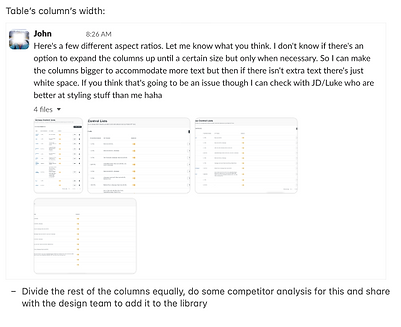
Chips


Tables


USABILITY TESTING
& ITERATIONS
First round
Tested 7 users
In the initial phase, we conducted testing on the first prototypes, involving 2 Sinch users and 5 participants from a user testing platform. Preliminary findings indicated pain-points in users' ability to discern the status of their fax transmissions and access detailed fax information. Furthermore, based on product requests, there was a need to integrate additional information, namely a fax ID, comprising an alphanumeric string.
Adaptation and refinement
In response to the feedback garnered and the identified requirements, I iteratively refined the designs to enhance the overall user experience.
Second round. A/B testing
Employing an A/B testing methodology, we presented two distinct approaches to align with the product team's directive and a different approach with the use of new components.
A
Status
Introducing distinct status indicators for In Progress, Completed, and Failed transmissions. Leveraging our existing color palette, these status elements were imbued with visual cues to enhance visibility.
View fax
Advocating for user-centric design principles, I proposed the utilization of bold, hyperlinked text, "View Fax," within the table interface. This approach aimed to streamline the user journey, promoting ease of access to fax details.
Date created/ID
Proposing the inclusion of the fax ID beneath the creation date, aligning with identified requirements.
_edited.jpg)

B
Status
As per product specifications, status indicators were presented solely as text, devoid of color.
View fax
Users were required to click on the creation date, rendered as a blue hyperlink, to access fax details. This approach diverged from Approach A in terms of navigational hierarchy.
Date created/ID
Consistent with Approach A, the fax ID was positioned below the creation date for coherence and practicality.
User testing
outcomes tested on
8 additional users
Feedback analysis revealed that Prototype A garnered favorability, with users praising its efficiency in accessing fax details and discerning status indicators.
Notably, Prototype A demonstrated superior performance metrics, evidenced by a reduction in task completion time by an average of 5 seconds. Additionally, users lauded its user-friendly interface, rating it as clearer and more intuitive compared to Prototype B.

RESULT & IMPACT
Following the handoff to the development team, I collaborated closely with them to ensure seamless integration and alignment with the envisioned designs. Post-launch, our efforts culminated in significant achievements, indicative of the project's success:
60%
Retention
rate
Within the initial 6 months post-launch, reflecting the app's ability to retain users and sustain engagement over time.
7-10
Session duration
mints
indicative of users' active participation in administrative tasks and fax transmissions.

90%
Satisfaction
rating

REFLECTION &
TAKEAWAYS
What I did well and what I am proud of
I successfully translated initial sketches into high-fidelity designs, ensuring alignment with Sinch's design system. By incorporating user feedback and iterative testing, I enhanced the app's usability and functionality. Achieving remarkable post-launch results, including a commendable retention rate and positive user feedback, underscores the efficacy of our collaborative approach and user-centric design principles.
What I'm taking with me
This project reinforced the importance of user feedback and iterative design methodologies. Moving forward, I'll prioritize closer collaboration between design, development, and product teams. I'll also maintain adaptability and resilience in navigating design challenges, aiming to deliver innovative and user-centric solutions in future projects.
Thanks for reading


bottom of page